Devlog 2: Finished prototype
Introduction
Well, well well,... Look who's here. -Pets cat while rotating chair-
Our lovely reader is back again for some more development progress?
You're in luck! This week has been quite the progressive one.
Not only am I glad to give you a first look at our future character models, but I am also happy to present some new gameplay features.
Let's start de devlog again with a popular dutch saying "Amai, what a serious sandwich!" This week has a lot to cover so let's get rolling
Note:
For anyone reading this post, feel free to give your opinion about our progress or let us know what features you'd like to see. Your feedback is greatly appreciated and can only help us grow!
Art
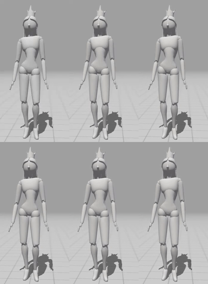
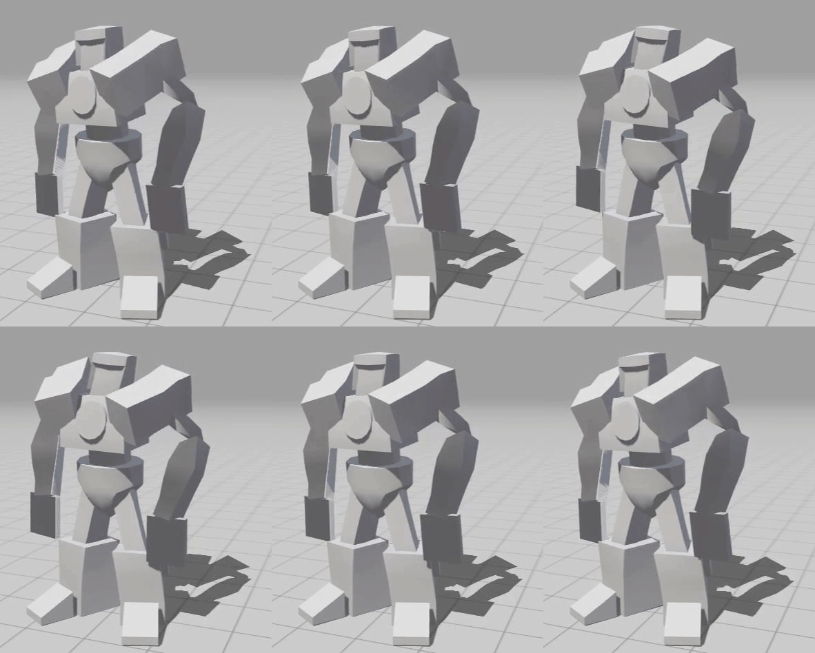
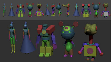
First and foremost: Behold! 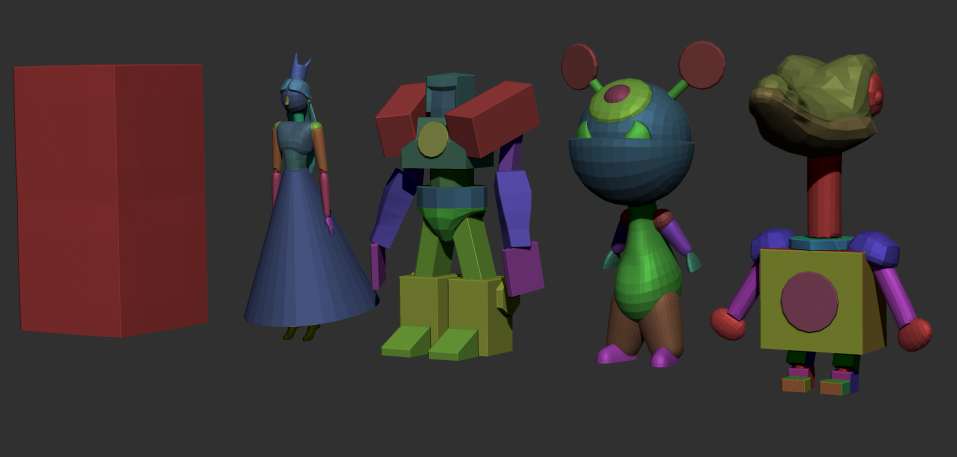 A more detailed image of these models from different angles can be found at the end of our scrollable image library at the top of this devlog.
Our crazy cat lady Christiane did her best to bring the team's imagination to life!
Sadly enough for Christiane, there wasn't an almighty being that granted her the knowledge to instantly craft these unique characters. A large number of sketches had to be made to find the sweet spot that we were looking for.
While creating these characters, we have to take into account three major criteria:
- Each character needs to be a toy-like character to fit in the story
- All characters need to have a similar hitbox to ensure that platforming feels the same for each character.
- All characters need to feel distinguishable. Remember Dora? We want to avoid chaos.
The following image shows some of the iterations

Some of the iterations
From all these sketches, our 4 favourite designs were selected and a multitude of iterations on them was made.
As you can see, the main focus was on the silhouette:
- The Gundam is a square
- The princess is a triangle
- The plushy is an upside-down triangle
- The crocodile is an hourglass.
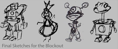
Afterwards, these sketches were taken into Zbrush. Adding shapes and pushing them around until we had a result that everyone liked.
Animation
Just like our favourite antagonist Sid from Toy Story would scream: " The toys!! The toys are alive!"
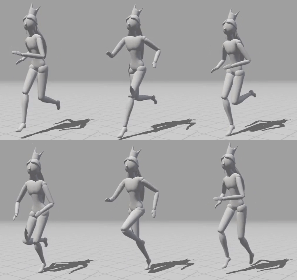
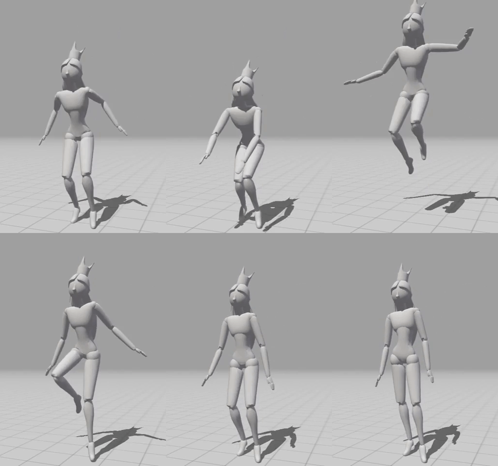
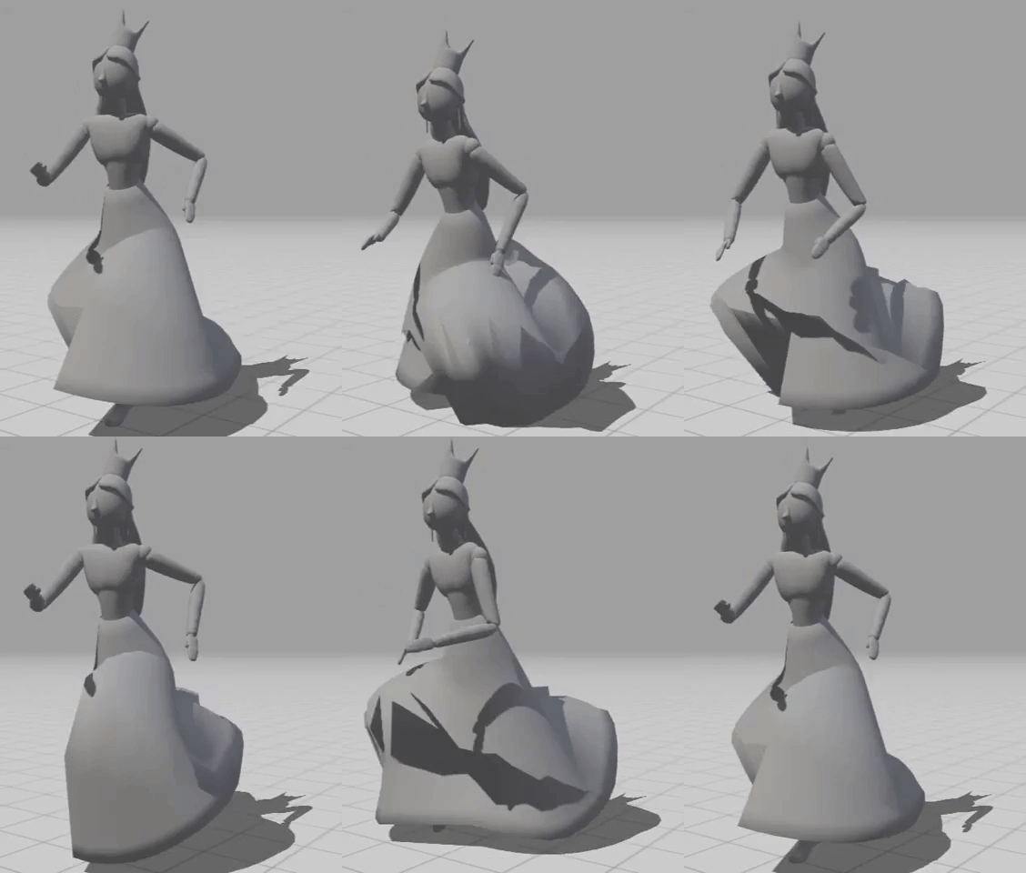
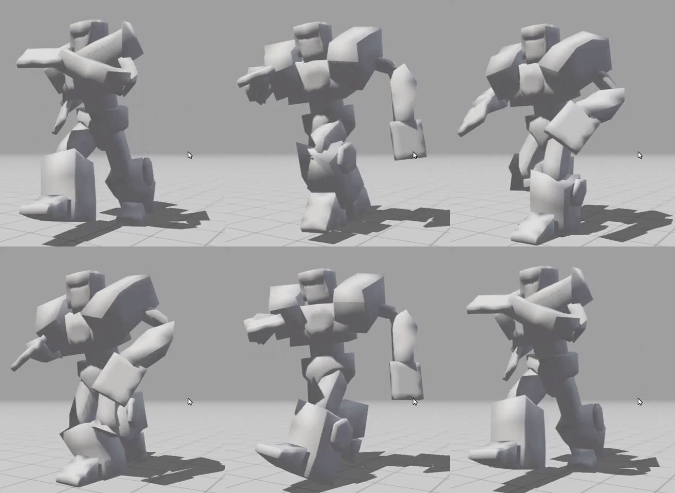
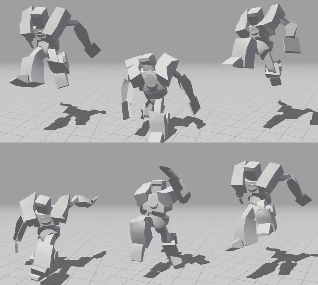
If you read the blog post from top to bottom like any normal human being, you've probably noticed the scrollable gif gallery at the top of this post. This gallery contains some basic Mixamo animations that have been implemented on our models.
We wanted to give our models some rigs as soon as possible for two main reasons.
- We want to get familiar with the animation system in Unity. The sooner we can start on this, the more bugs we can prevent by the end of this project.
- Doing this helps us to figure out which animations fit a character. The personality of each individual character is important to us, which is why our artists do their uttermost best to make them unique and readable.
Why Mixamo?
The main reason why we are using Mixamo is due to our time constraints. The Mixamo database contains a lot of high-quality animations which helps us with setting things up. Unique character-specific animations will of course be made by our majestical team of artists. Depending on how smooth the development goes, we would like to create all animations. However, only time will tell if we'll get the chance to do this.
Although Mixamo will be a good solution, we will definitely need to fix some "Skin problems" of our character models if we plan on using this in the final version. By closely analysing our animations, you can notice some issues with how some parts of the models behave during the animation. To fix this, we will re-import the model, together with the animation, into Autodesk Maya and use the "Skin weight" tool to adjust the skin influence of some bones. However, due to our "not-so-small" to-do list, it is uncertain when this will be done.
Level design
Now it's time for an important but easy piece of the puzzle to achieve an enjoyable game experience: Level design! No problem. Super easy! ♫♫ Just gonna place some blocks here and there and.. hmm? Hehe, a bit harder than expected but still doable... Uhm... Let's rewind that.
- Cue RewindSound.sfx -
Now it's time for an important but difficult piece of the puzzle to achieve an enjoyable game experience: Level design! Before we could start designing a level we should not underestimate it and take a few things into account:
- The scale of the level. - What is the overall size and how are all platforms spaced from each other?
- Unique platforms. - Will all platforms be static? Will some influence the player's movement?
- The flow of the level. - Is it linear or not?
The most important factor concerning the scale of the level is that we're creating a fast-paced platformer game. All platforms in-game should be feasible to reach. It doesn't matter if this is via a wall jump, a jump pad, or even a simple jump. To keep track of the scale, we tried to add some simple character sketches throughout our level draft.
Unique platforms can truly shape a level. Having a jump pad can give some diversity between all the wall jumps. Creating hazards can create more interesting races by taking risks. Although we did not develop a lot of unique platforms yet, we actively try to consider our options as such things can heavily influence the level. While creating the sketches, some unique platform ideas were scattered around to get a first look at what we could be getting into.
The flow of the level was a bit harder to figure out. The upper sketch of the image below shows you our first try. The level itself has a fun look with a lot of potentials. Some great ideas to split the players are already present, but there are still some slight issues. You might notice that, for the purpose of our project, the level is too linear. Our game does not solely focus on going from point A to B, but should also consider going from B to A. The players need to be able to race each other in all directions as the objective will frequently change. This means that most paths should be traversable in multiple directions. With this in mind, a second level was created which you can see on the lower part of the image below. At first glance, you noticed how much bigger this level is. This is to give our level multiple tracks to race on, which should lead to a unique game experience for every game.
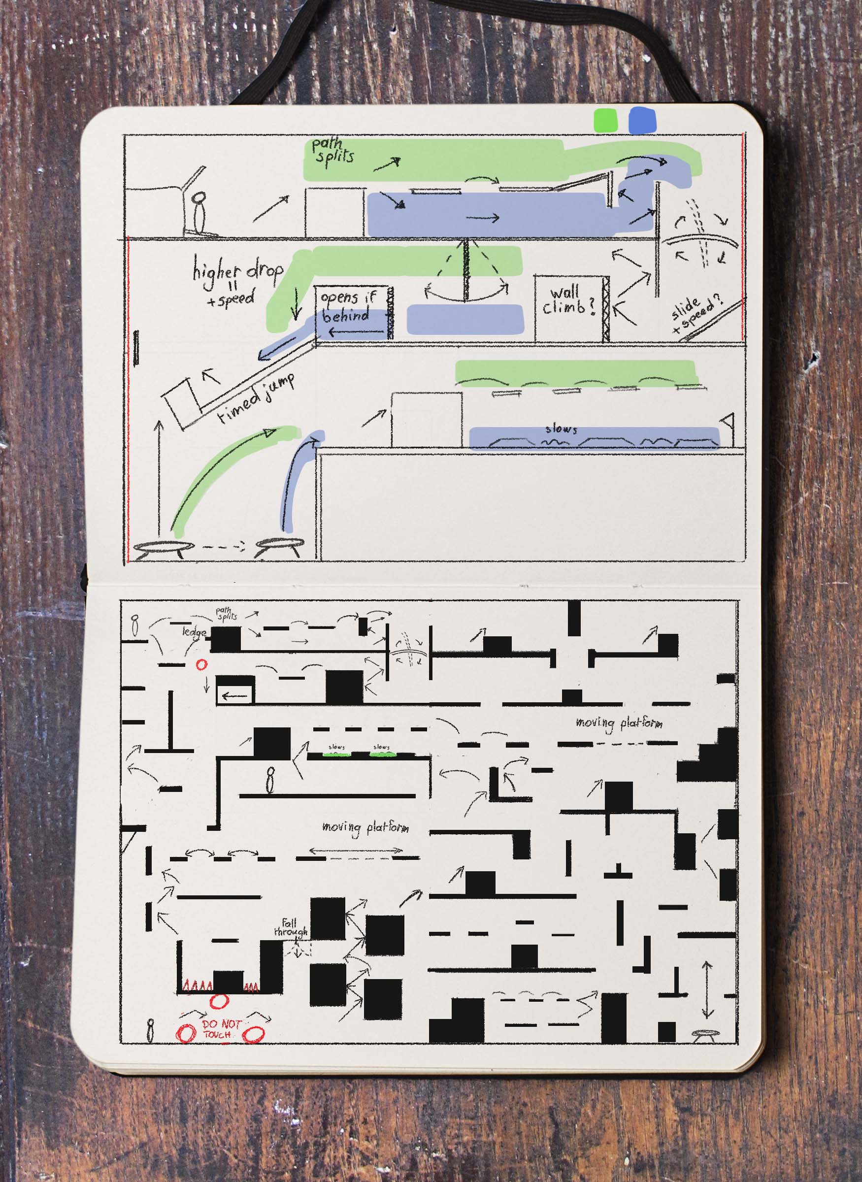
Still room for improvement
After playtesting the blockout from this level we notice that it still has some rough edges.
First of all, we should invest more time in precisely placing platforms to ensure all jumps are feasible. This is one of the most frustrating issues we currently have. By creating such a large level, we kinda shot ourselves an arrow to the knee by giving us less time for refinement. This is something we should remember for the production sprint.
Furthermore, there was also an issue that caught us by surprise. We noticed that the most linear parts of the level were the most fun to play. So we might need to reconsider solely choosing an open or linear level, but rather go for a combination of the two.
Prototype
Everyone knows that a beautiful game without any fun gameplay is like Popo without Nana (I bet you didn't know the Ice Climber duo's names -.-). Pretty useless without each other, right? That's why the big brain developers of our team did their best to add a few new important features.
Particles
Let's start with a simple one. Jumping and sliding make the ground go "poof".
A smokey particle effect is added to visually represent the actions of a character. Although this isn't "game-changing", it gives a nice dose of player feedback and enhances the experience.
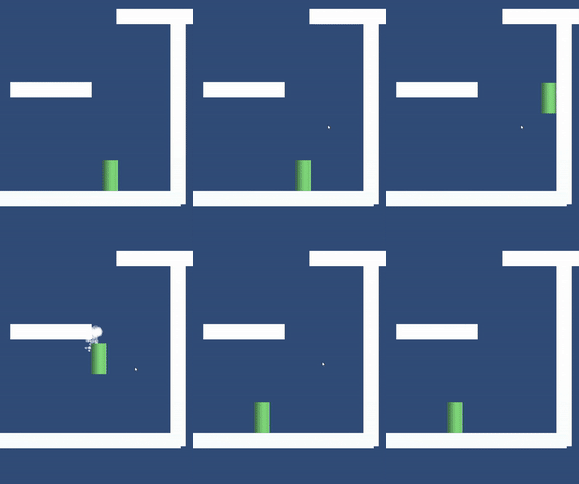
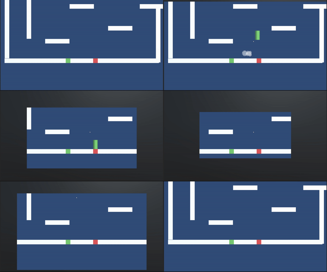
Dynamic Viewport
Finally, one of the main mechanics of the game got implemented.
Our greatest enemy, the camera borders, just got more powerful!
Get ready to snuggle with the contestants and expect the borders to creep up on you from all possible angles.
The concept is still the same: Hit the border and you're out! This gameplay feature is meant to shake up the flow of the game.
- If players are playing too safe, it will enforce them to start moving.
- If players are playing too aggressively, it can give less-skilled players a chance to catch up.
Currently, 'the borders of death' only come from either 1 direction or all 4. In the future, we're planning on expanding this feature by for example rotating the borders or splitting the screen in two. We're very excited about this mechanic and are eager to see where the future of our game will take it!
Objective Pointer
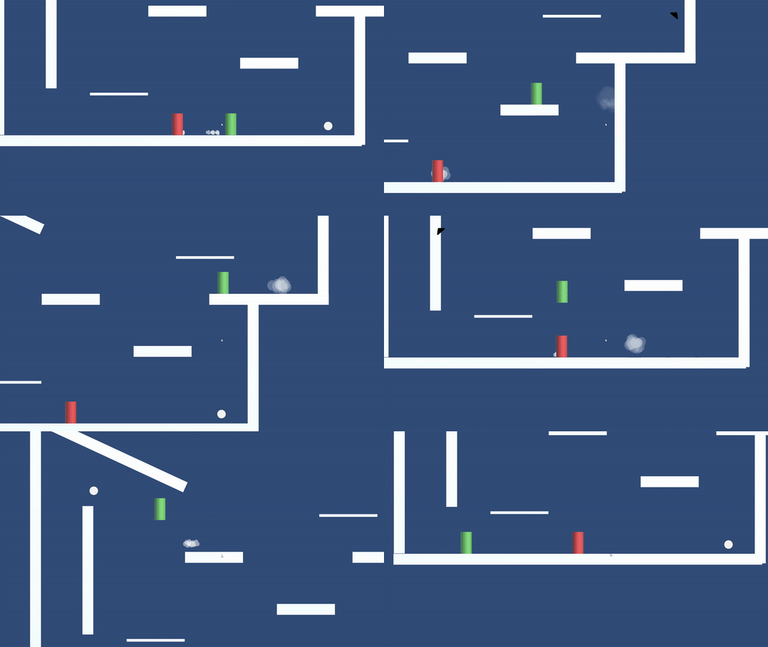
Let's not forget this is still a race. What does a race need? A finish line... Or at least an objective... You get what I mean.
We already had an objective that updated every time we reached it, however, we had no visual way of representing this.
A player didn't even exactly know in which general direction you had to go. You had to constantly guess where the target was by testing where the camera would follow you.
Luckily, this annoyance is no more! A subtle marker has been added to point in the direction of the objective. Once the objective is in sight, a white dot appears. This is of course not the final representation of this feature but it does the job quite well!
Currently, the marker points in the exact direction from the camera centre to the objective. However, we noticed that this could sometimes lead to confusing paths. In the future, we would like to implement a pathfinding algorithm that considers reachable paths. This will not only influence the objective pointer but also the player who's in first. Once this feature is in place, knowing the level will become an advantage that you can use during the race!
Bonus feature: The marker is hidden when "the borders of death" overlap it. This adds to the claustrophobic, anxiety-inducing feature of our dynamic viewport. The player either needs to remember where to go or play safe until the event is over.
One-way platform
Again, behold! our new invention! A one-way platform!
We already made a patent on this so don't even try to steal this idea from us.
Jokes aside, this one is a given. Creating a one-way platform is a no brainer for platformer games.

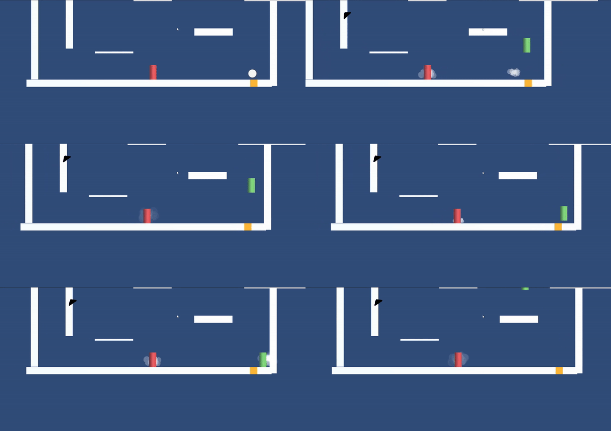
Jump pad
Similarly to the one-way platform, this is a given. We genuinely think we can create an interesting level using this. After playtesting, we found that the jump pad fits in perfectly with the fast-paced, icy movement in our game. Currently, for the prototype, the yellow color is visible enough to distinguish it from the other platforms.
We can all agree that this devlog was a serious sandwich, but a tasty one with a lot of different flavours. I thank you, brave warrior, for reading until the end. Kudos to you again!
We genuinely hope to see you again next week! Peace out!
-This text was funnyfied by uwu Gilly-
Game requirements
This demo requires the following:
- At least two players (Max 4)
- Only one player can use a keyboard!
The game is fully compatible with X-input Controllers. The keyboard is only available for 1 person.
Note: You will not be able to go past the character selector if there are not at least 2 persons ready.
Extra
You can use parsec to play the game online! :)
Files
Get Not For Sale
Not For Sale
| Status | Released |
| Authors | stef_bracke, CodeHard, Kobiezero, Sasha Vigneron, GillianAssi, Christiane_Schaper |
| Genre | Platformer, Racing |
| Tags | arena, Endless, Fast-Paced, Local multiplayer, party-game, PvP, Short, Unity |
More posts
- Devlog 10: The finish lineMay 22, 2022
- Devlog 9: Start of polish sprintMay 16, 2022
- Devlog 8: End of production sprint 2May 09, 2022
- Devlog 7: Production sprint 2, second weekMay 02, 2022
- Devlog 6: Start production sprint 2Apr 25, 2022
- Devlog 5: End of production sprint 1Mar 28, 2022
- Devlog 4: Production sprint 1, second weekMar 21, 2022
- Devlog 3: Start production sprint 1Mar 15, 2022
- Devlog 1: ResearchFeb 28, 2022
Leave a comment
Log in with itch.io to leave a comment.